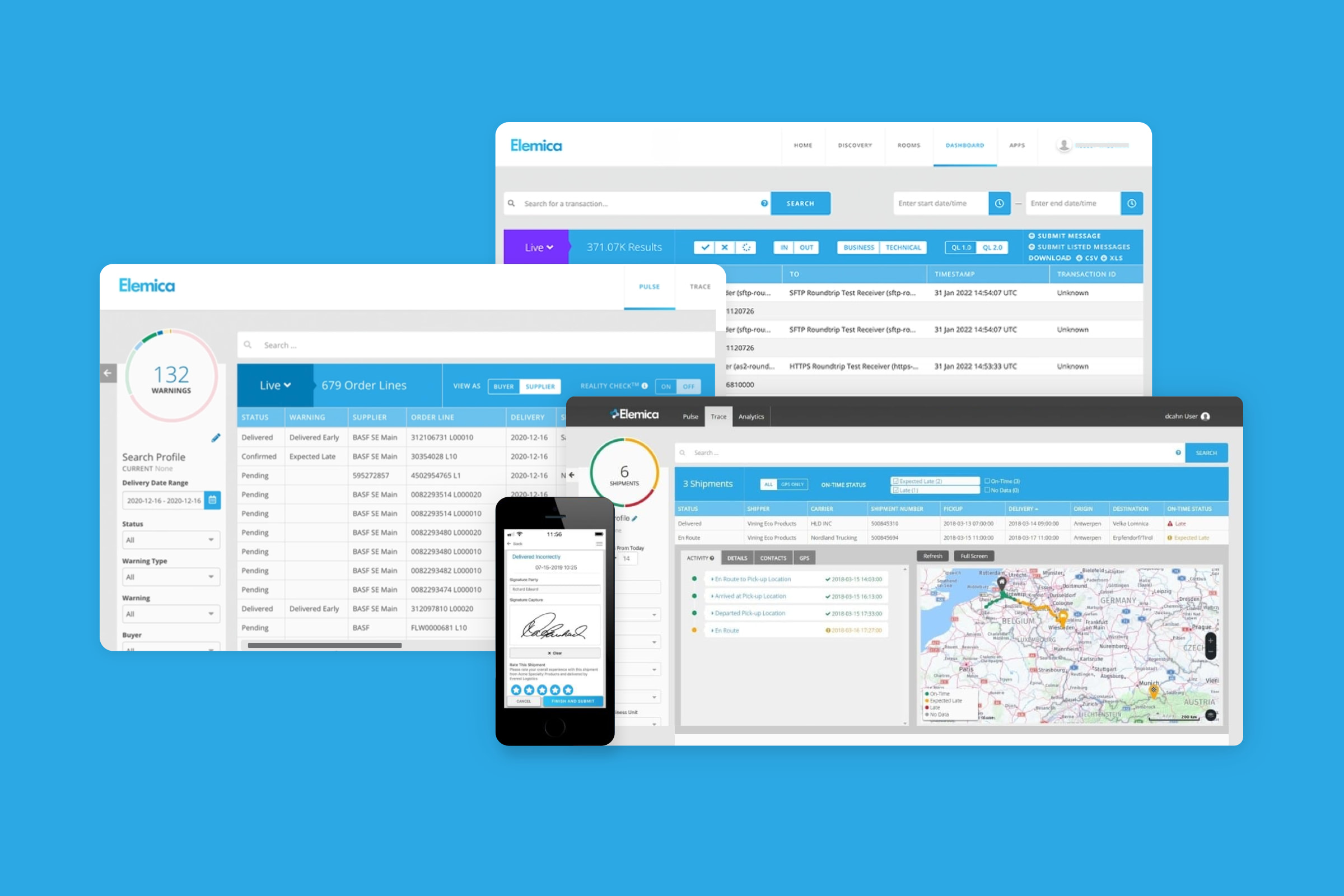
I worked with Elemica to build a product component library and product features that empowered logistics teams to track and make decisions about shipments.
In my role as a UX/UI Designer, I was responsible for creating a design system that would allow the design team to quickly mock up new features and layouts. I also worked on several key projects, including a risk management dashboard and a shipment tracking app.
The component library was adopted by the team and used to create all new features. It helped to keep designs consistent and improved the overall user experience. The product team was also able to ship new features faster.

I built out user personas to consider user Jobs to Be Done in the design process.

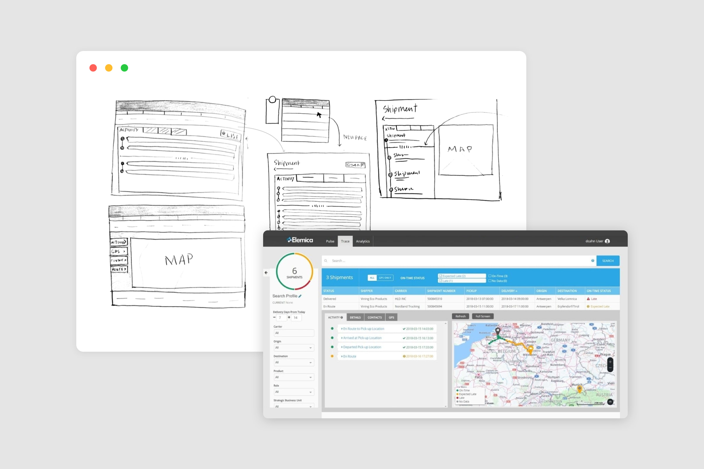
Sketches and mockups for a risk management dashboard.