I led product design for the Embody team to launch a menstrual wellness app with a mission to empower users with personalized menstrual cycle insights and strong data protection. I'm a big supporter of Embody’s mission, and I enjoyed working closely with a small team of engineers, founders, and marketers to bring the Embody app to life.
My role involved wearing many hats! I conducted user research, directed brand photo shoots, and led design execution from concept to MVP launch for the mobile app and website.
Prior to Embody, women faced an industry that didn’t prioritize their protection. Some frustrating challenges:
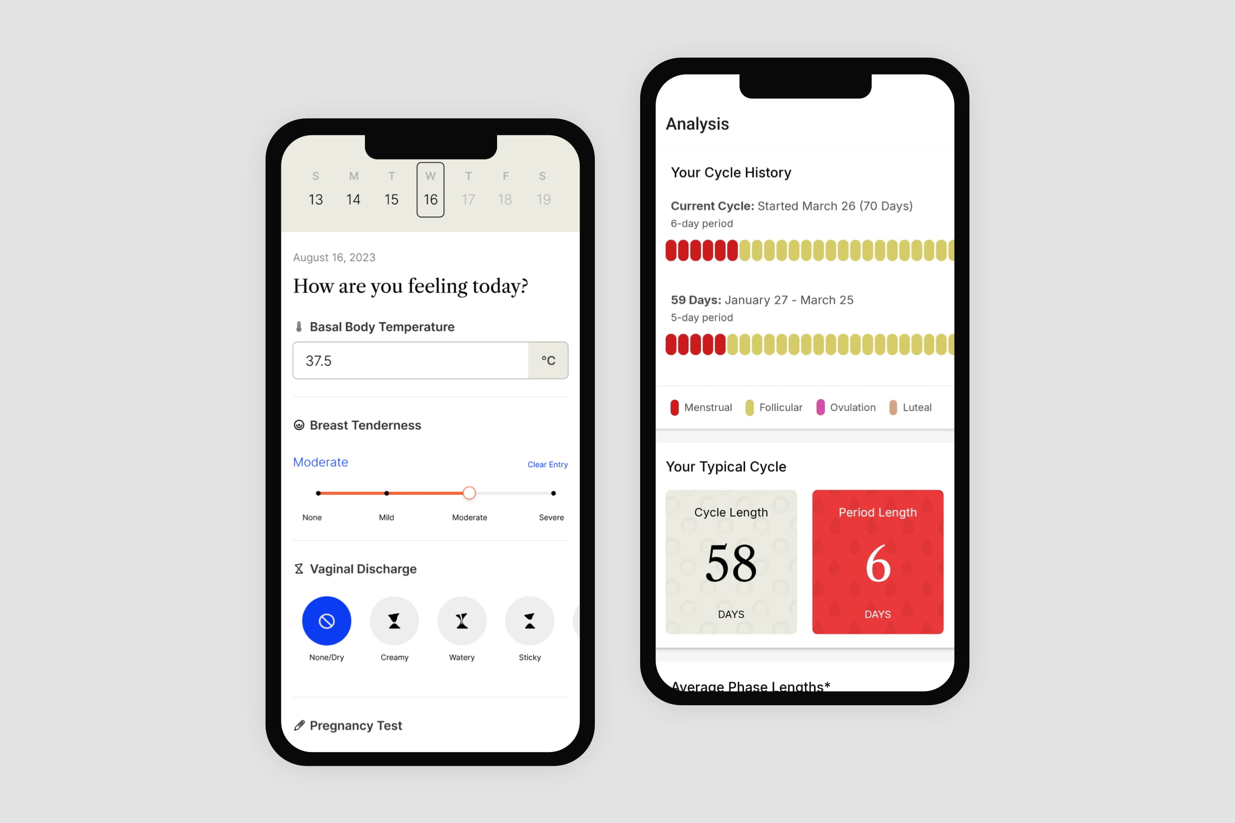
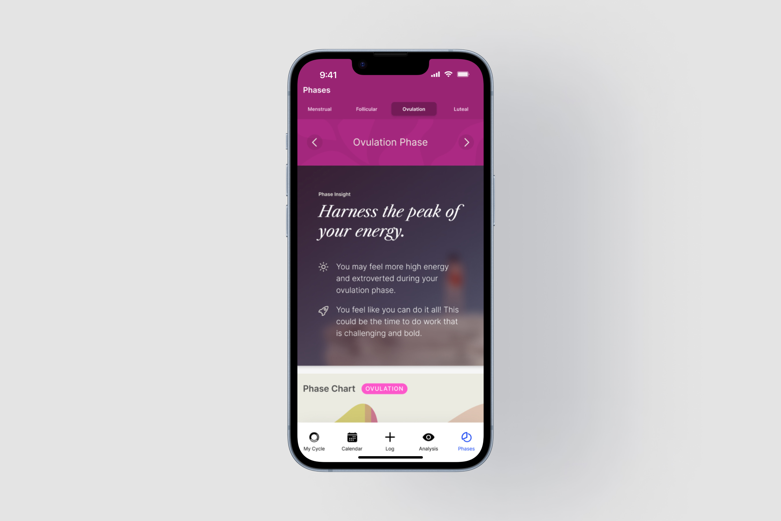
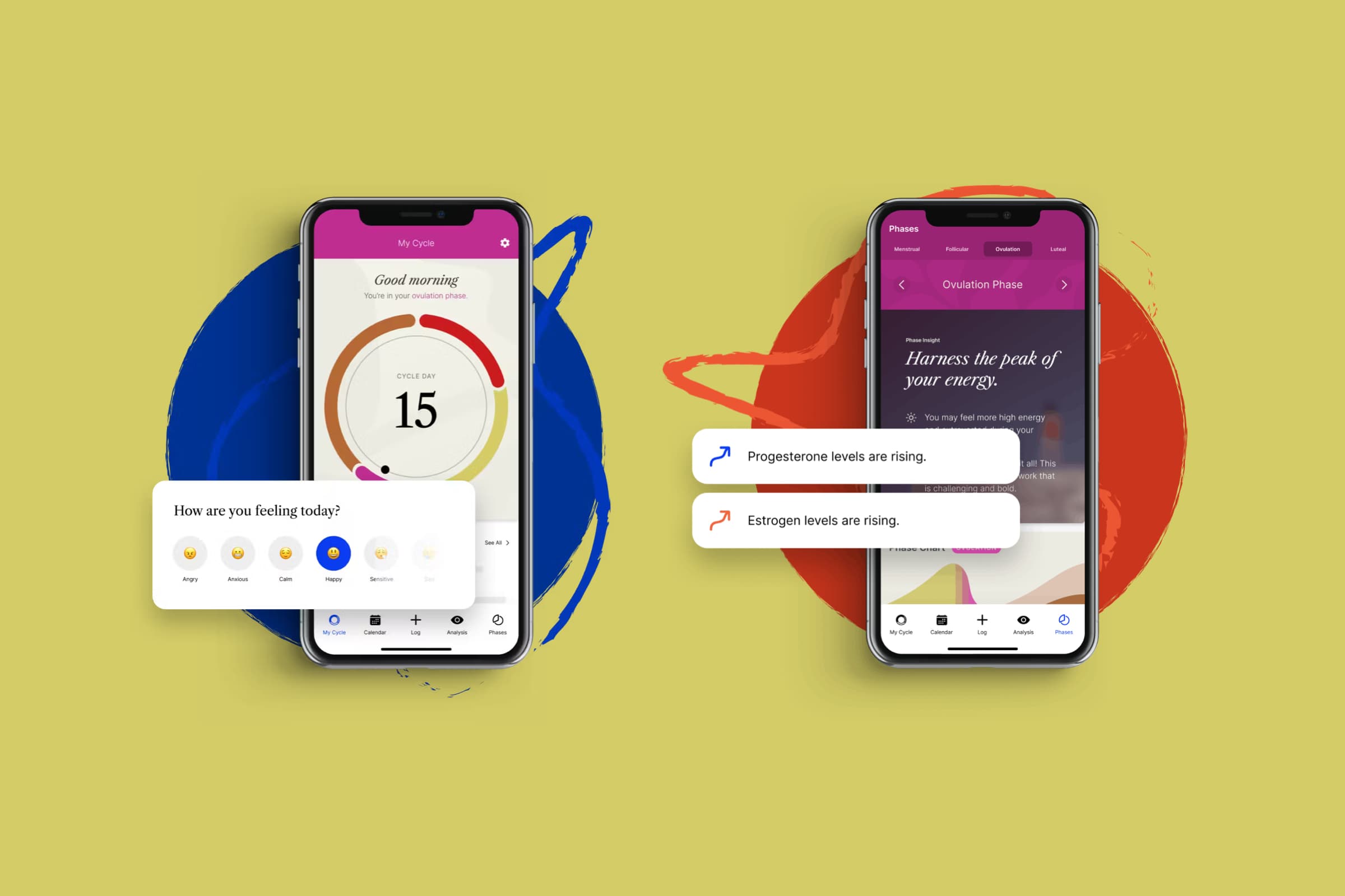
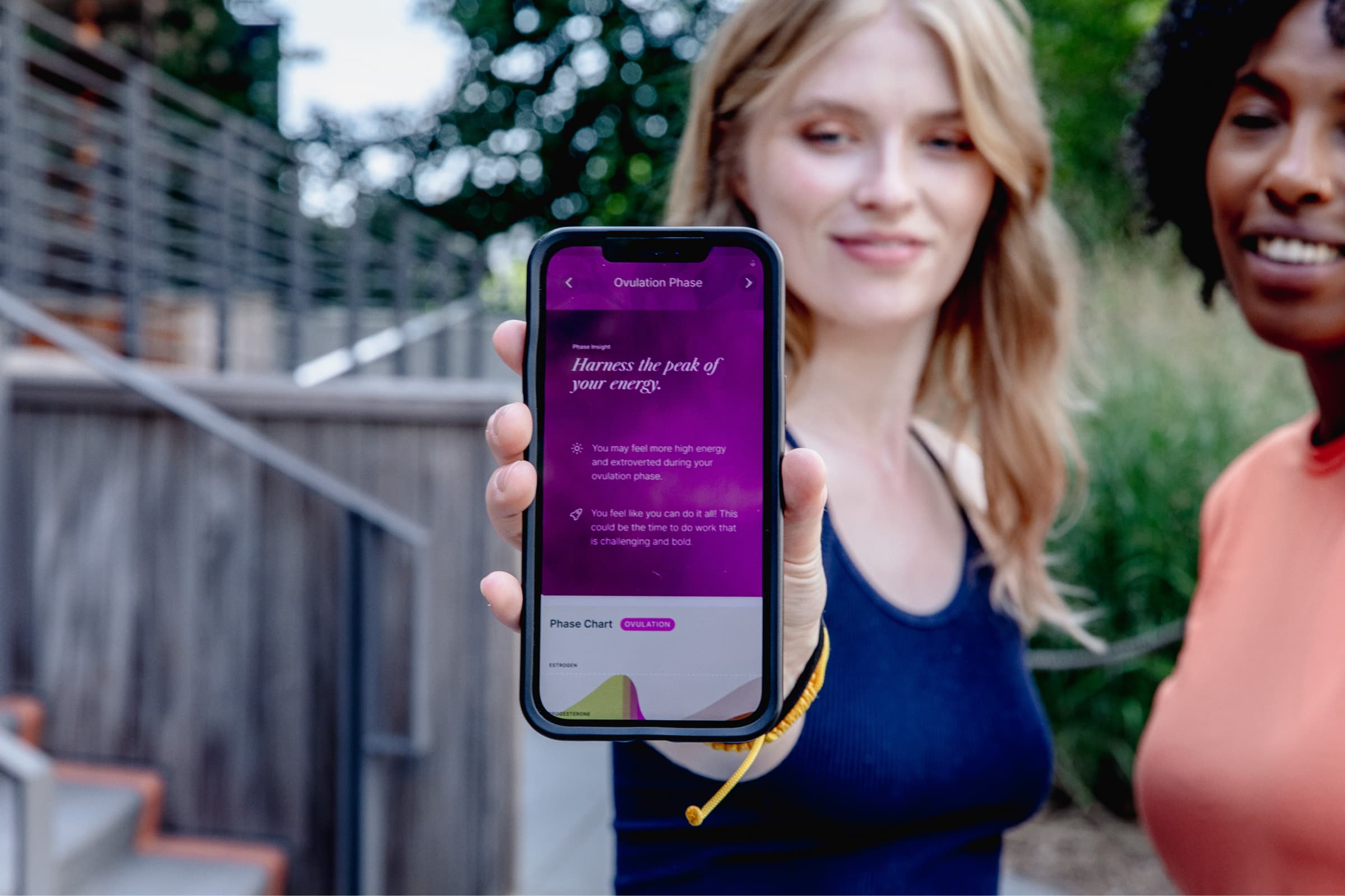
The Embody app.
The Embody app provides personalized cycle insights and protects user data by encrypting and storing data locally on users' phones.
The app has been featured in several publications, including Oprah Daily and Newsweek. To date, the app has grown to 100,000 users with a 4.6 customer rating in the app store.
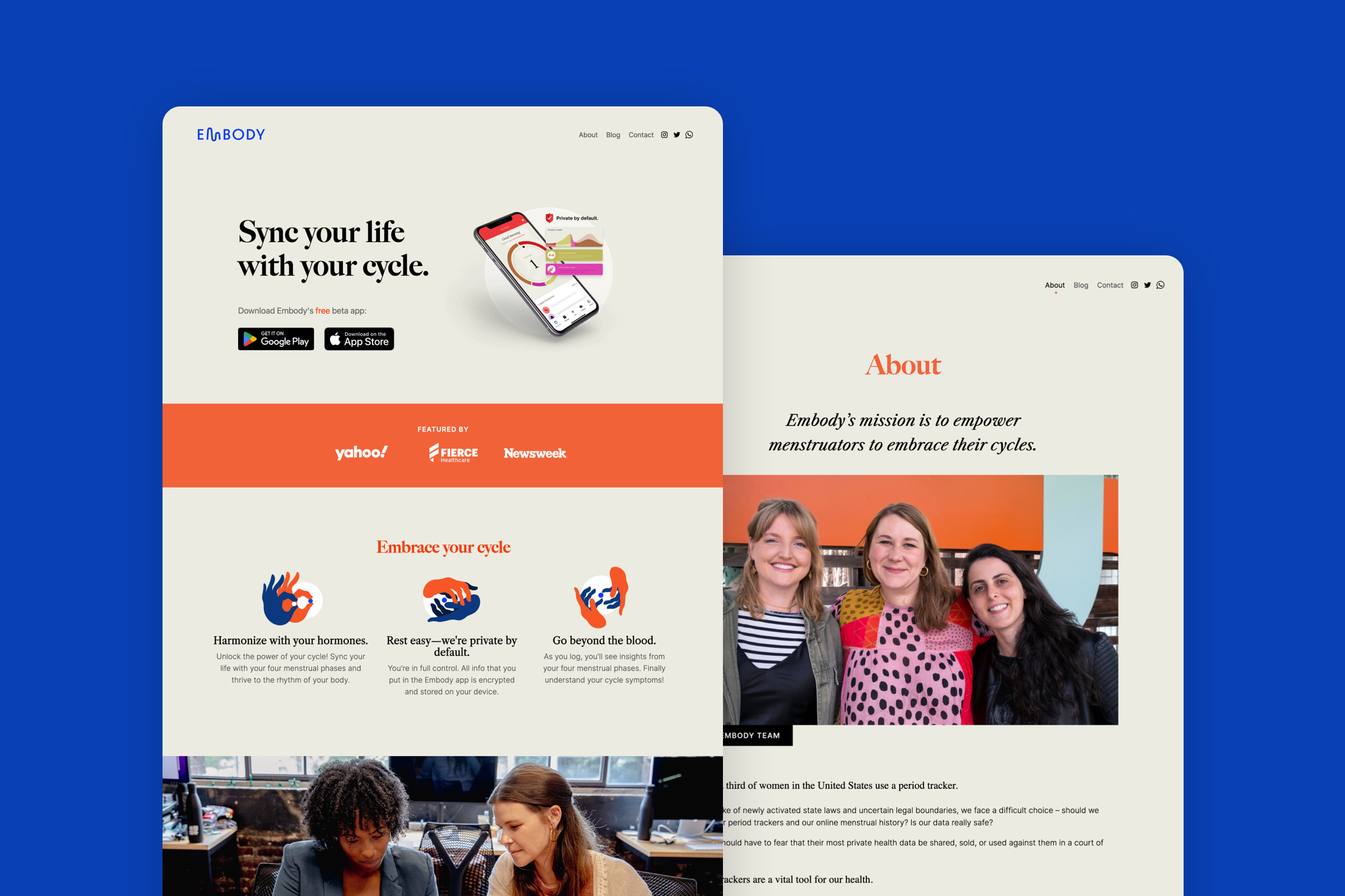
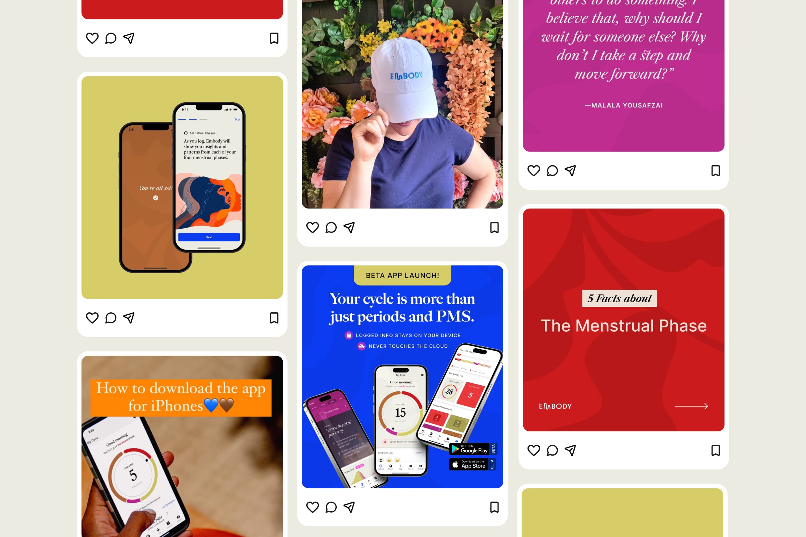
The Embody app website and blog
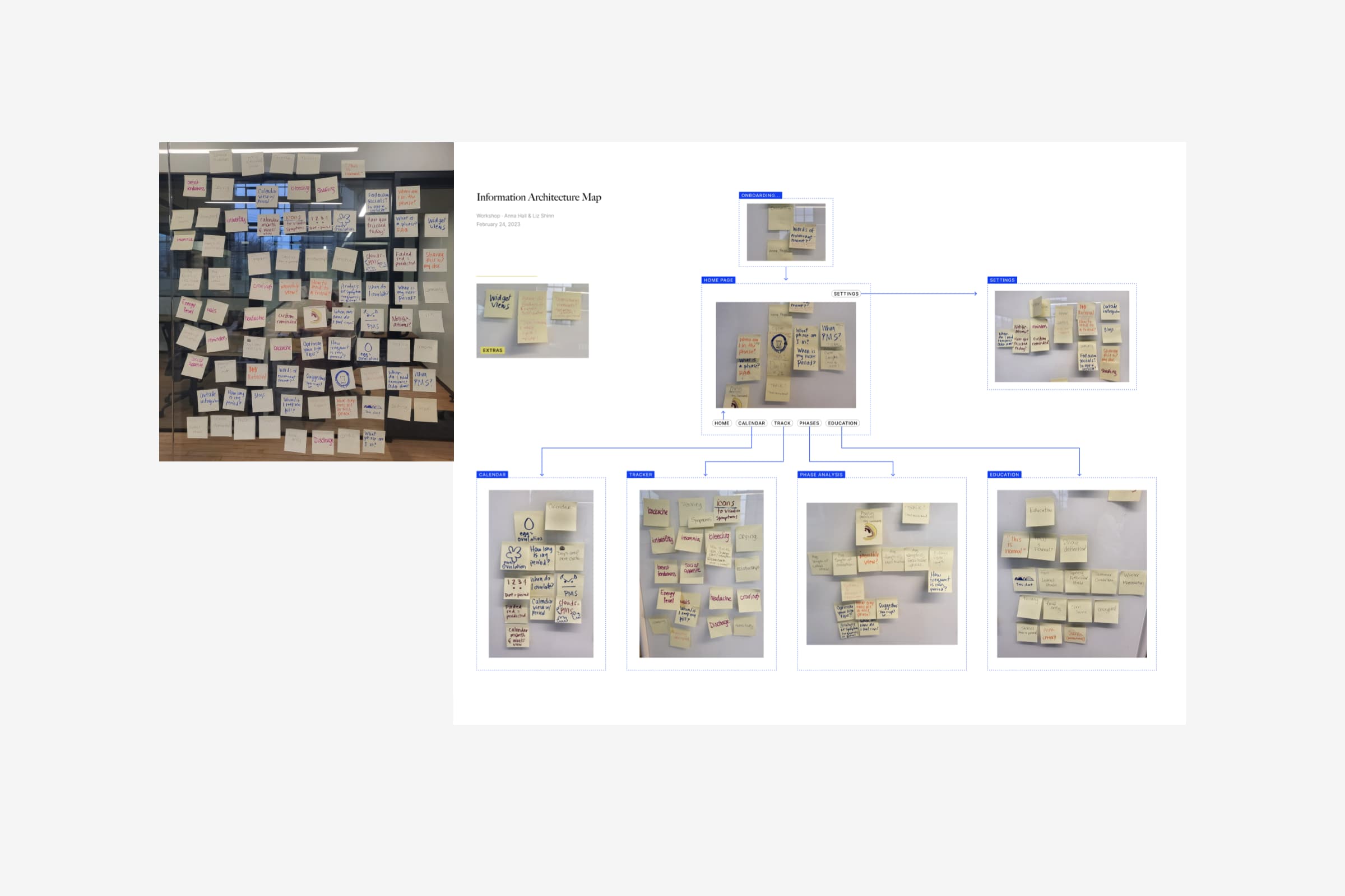
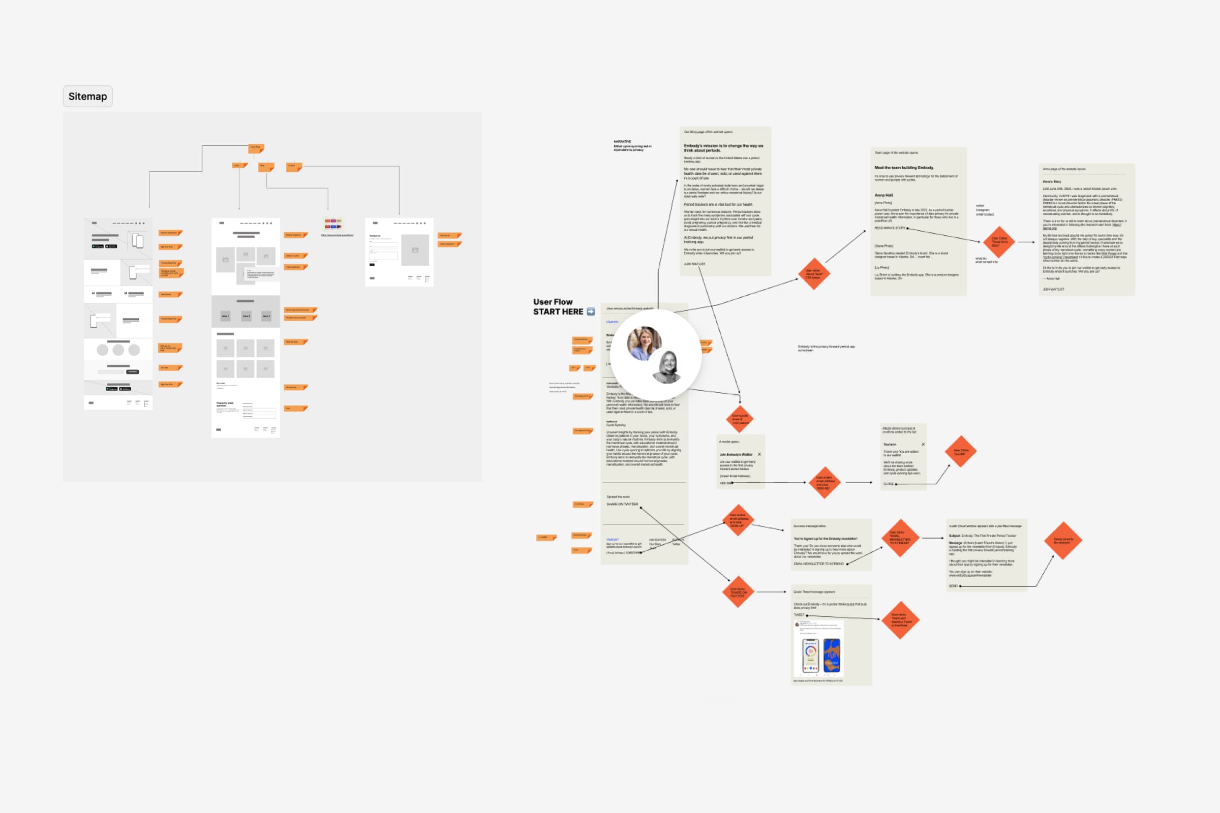
A Jobs to be Done brainstorm workshop I facilitated
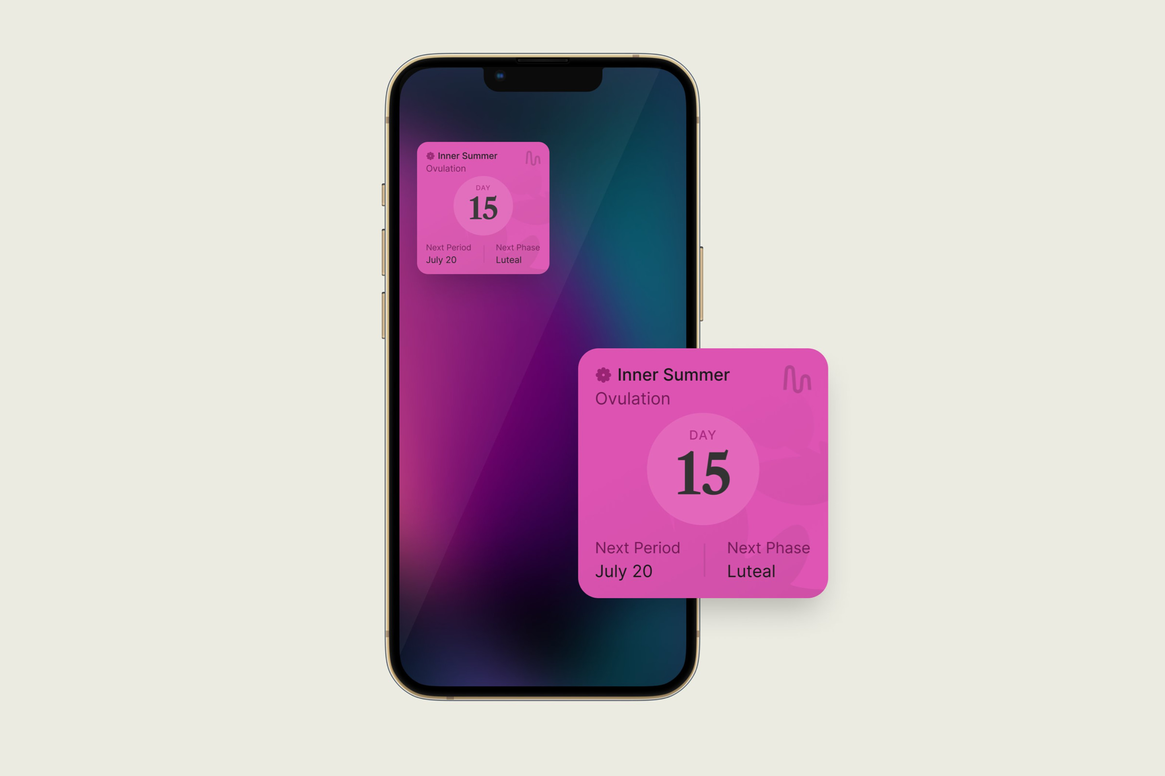
Users could see their cycle details from their phone home screen with the Embody widget
An Embody app feature for cycle phase meditation
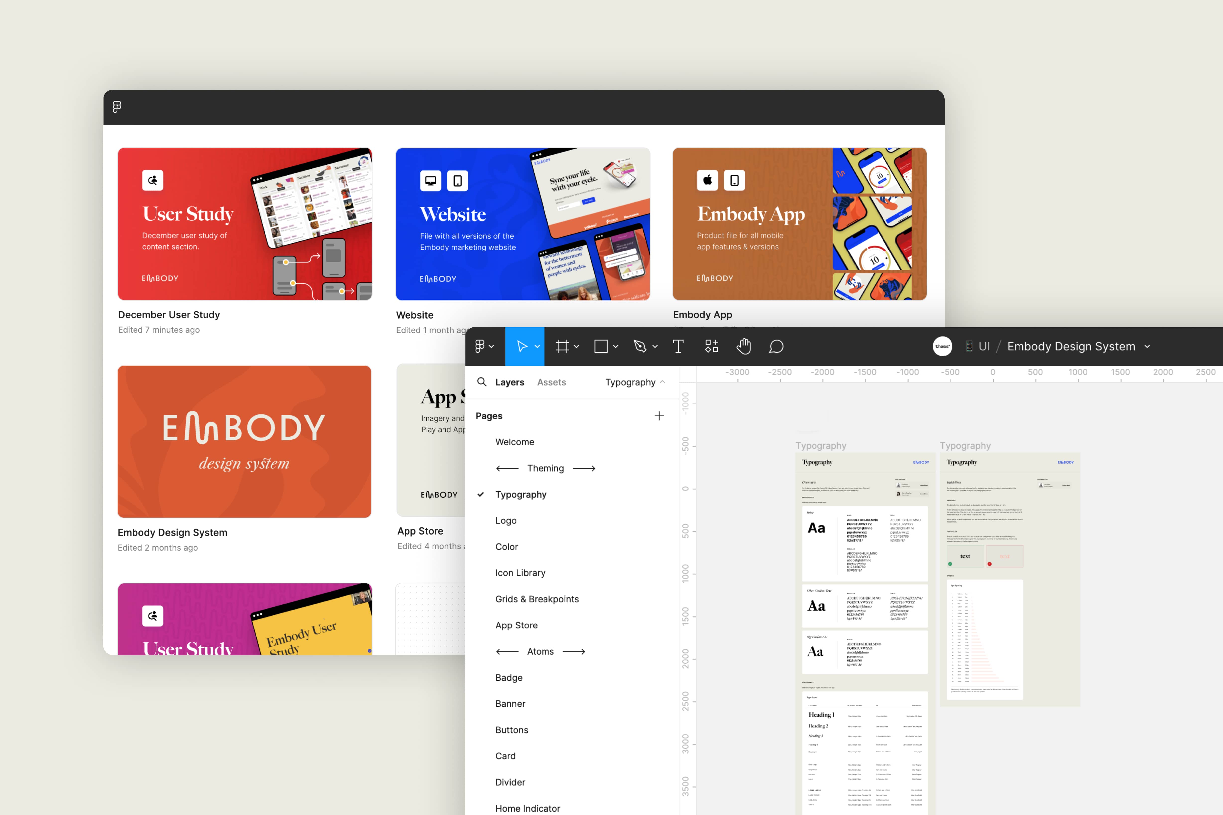
Embody design system and other Figma files