The team was wasting time debating over bespoke solutions and correcting inconsistencies in designs that didn't have a cohesive user experience.
Decisions were getting lost in team chat threads, and we needed a central source of truth.
A design system would help us work better as a team. The UX Lead and I researched the available open source options. Together as an engineering and design team, we chose Chakra's open source React library as our base system for development.
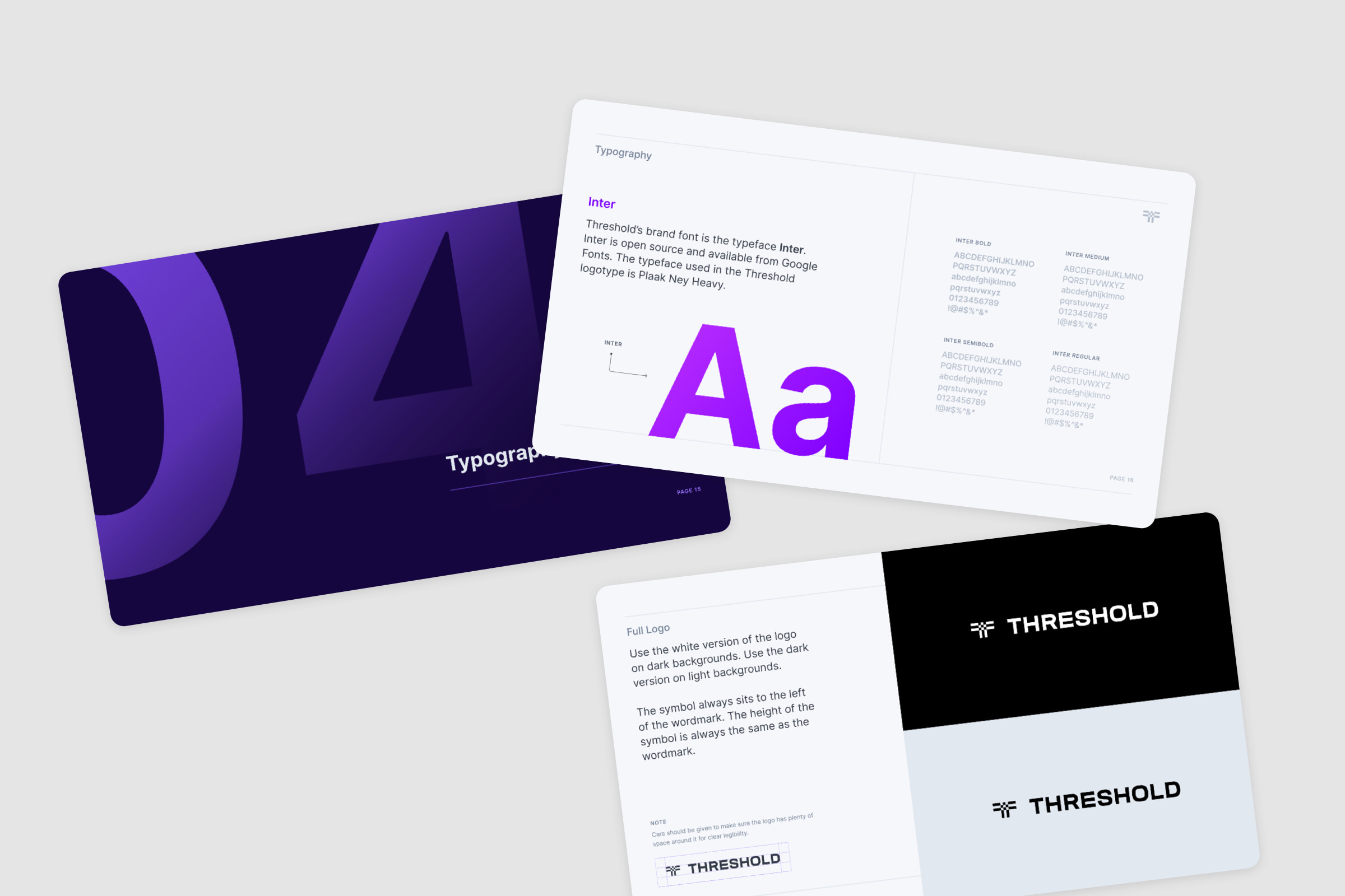
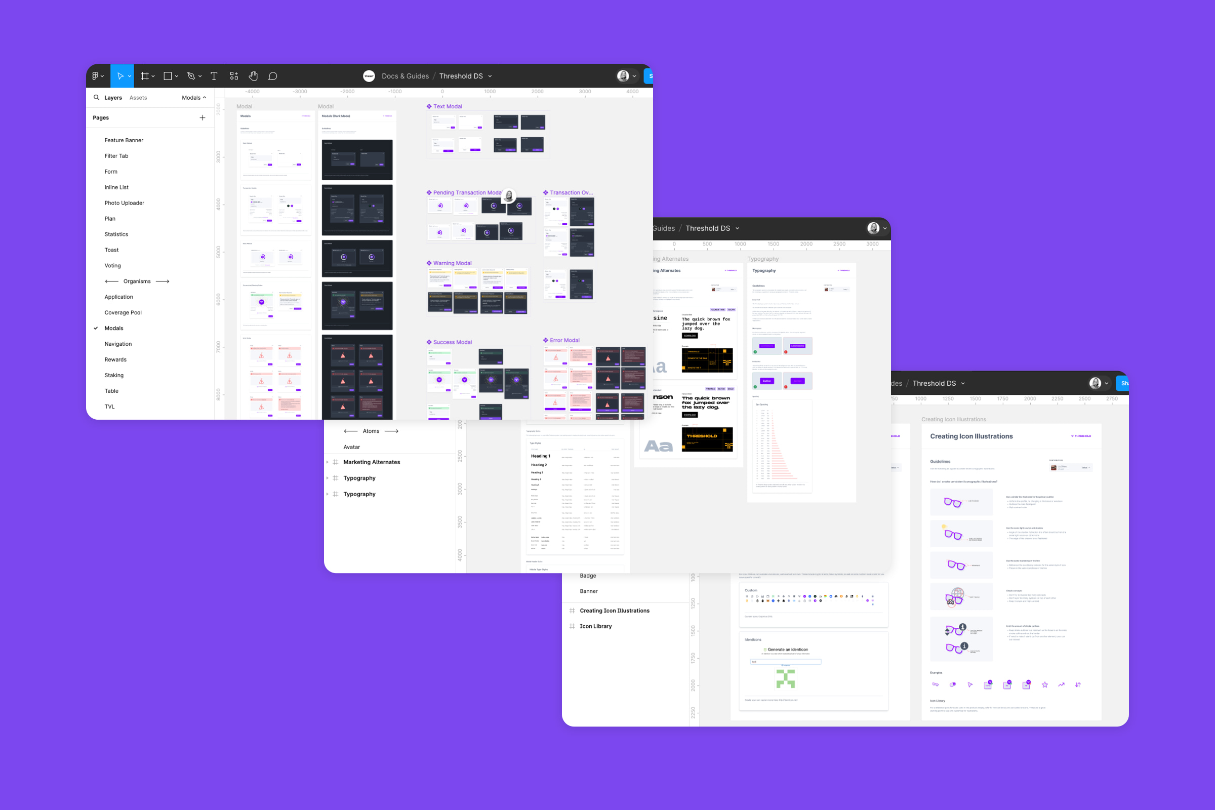
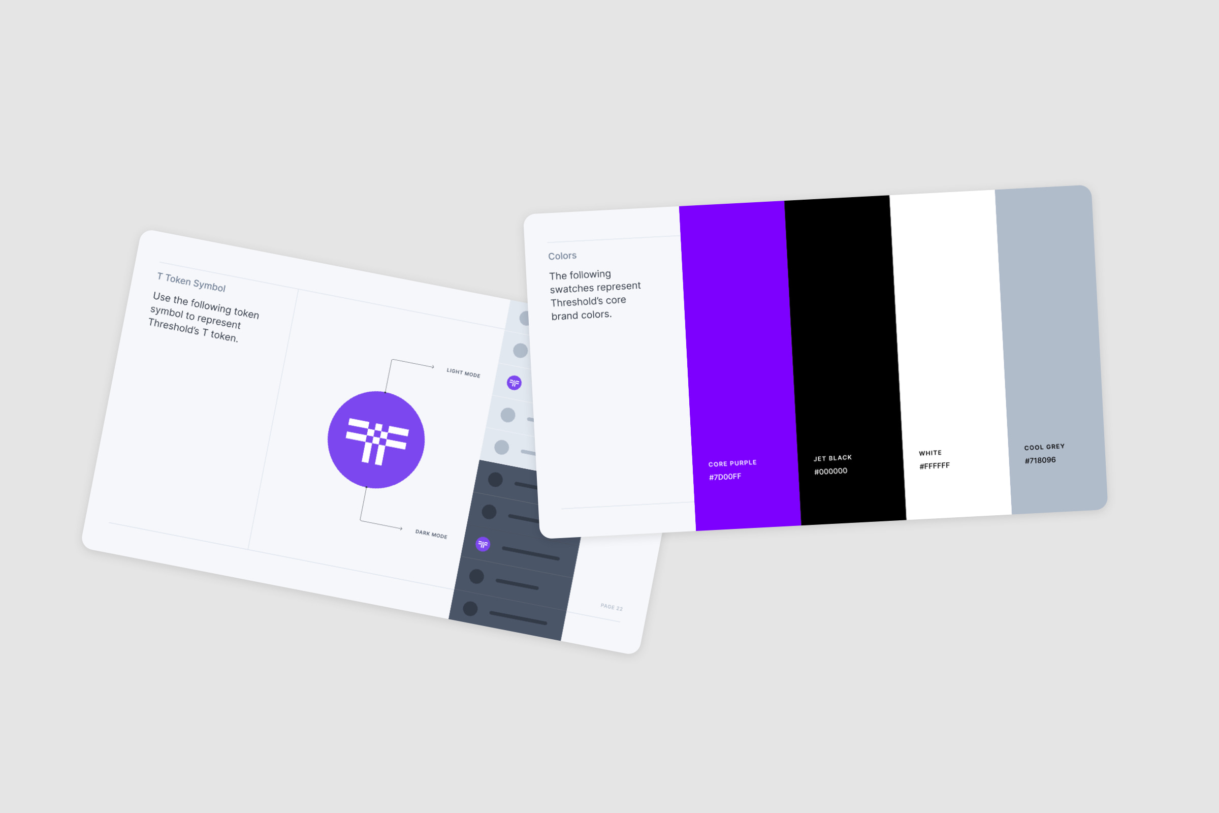
For the design team, I built out Chakra's limited Figma file using an atomic structure with Threshold's branding, using Theme elements (e.g. color, typography, grids) and Component elements (e.g. atoms, molecules, organisms).
The engineering team prioritized extensive code docs, positive reviews from other engineers, and flexibility in customization. The design team prioritized visual maturity, active maintenance, and a robust existing Figma resource. After some debate, we landed on Chakra as the best solution for both design and engineering.
As we introduced new features, we periodically needed to tend the design system. Myself and the UX Lead Sasha worked together to tend the design system as we added new features to the Threshold financial dashboard. We settled on a sprint schedule to coordinate our efforts.
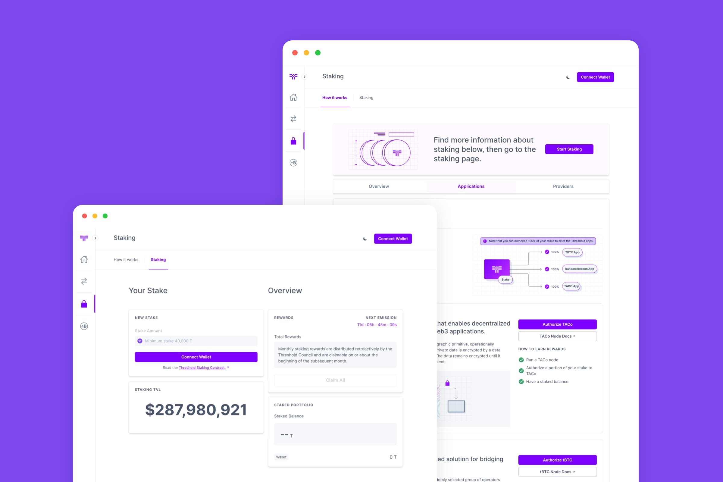
Using the design system for the Threshold dashboard helped us to work together as a design team more efficiently and to provide visually consistent designs to the engineering team.
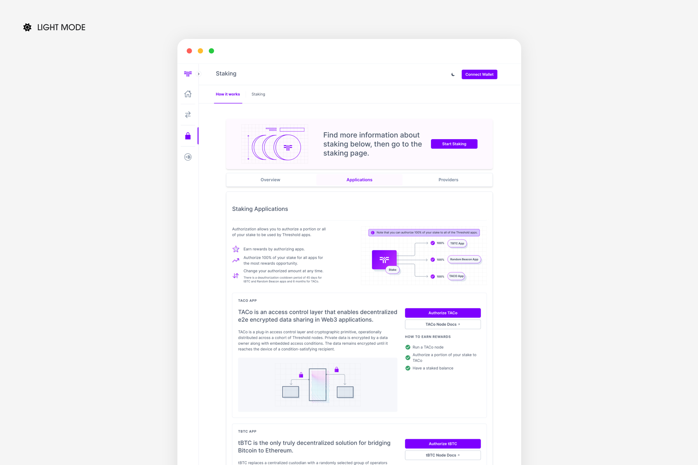
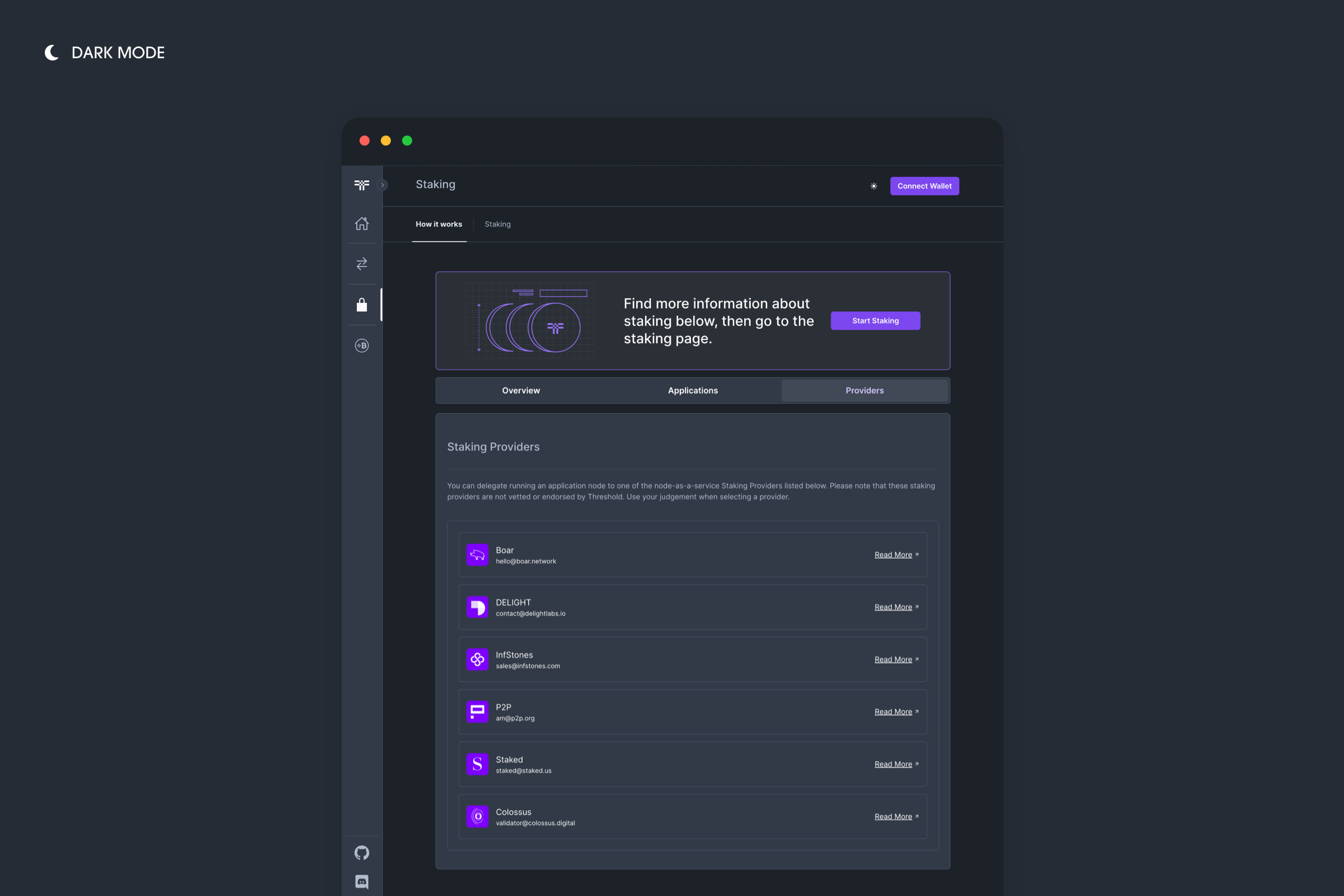
When new design hires joined the team, they benefited from the documentation and could quickly get up to speed. You can see a few screens from the product below in both dark and light modes.
A core value of our team at Threshold was to build in public and contribute to research efforts in the web3 space.
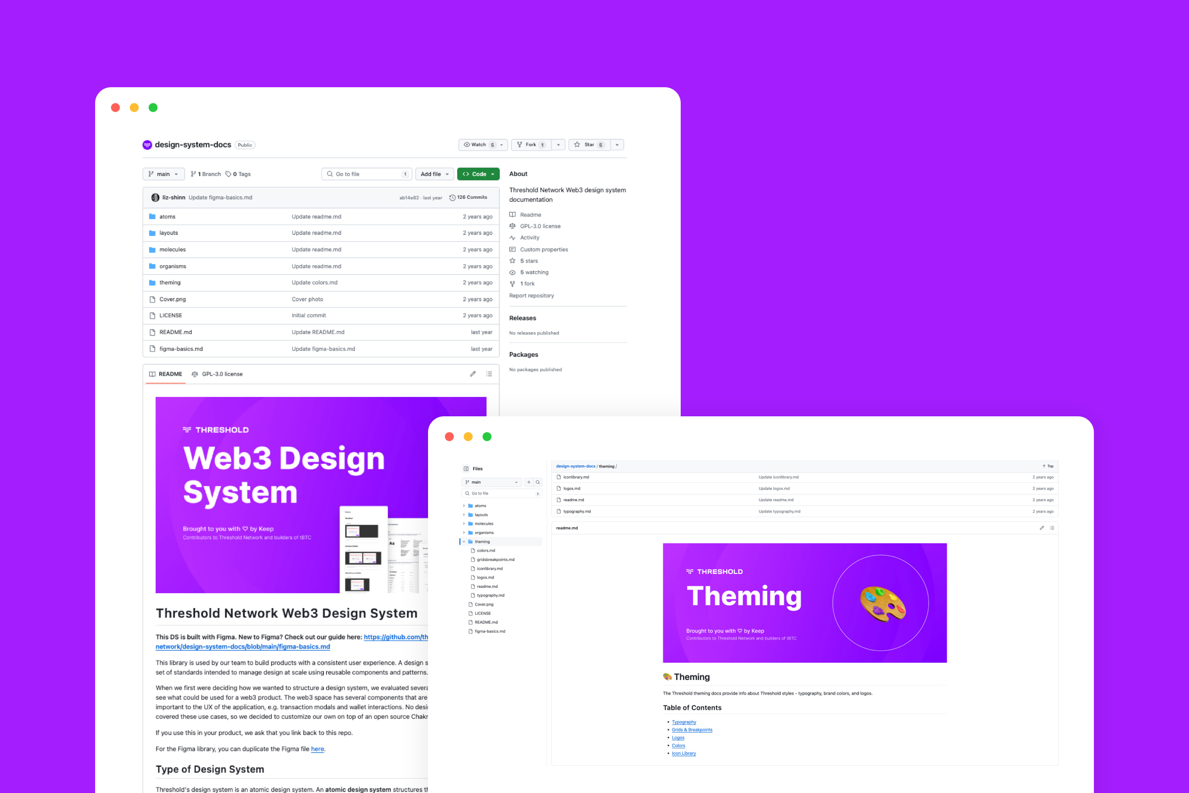
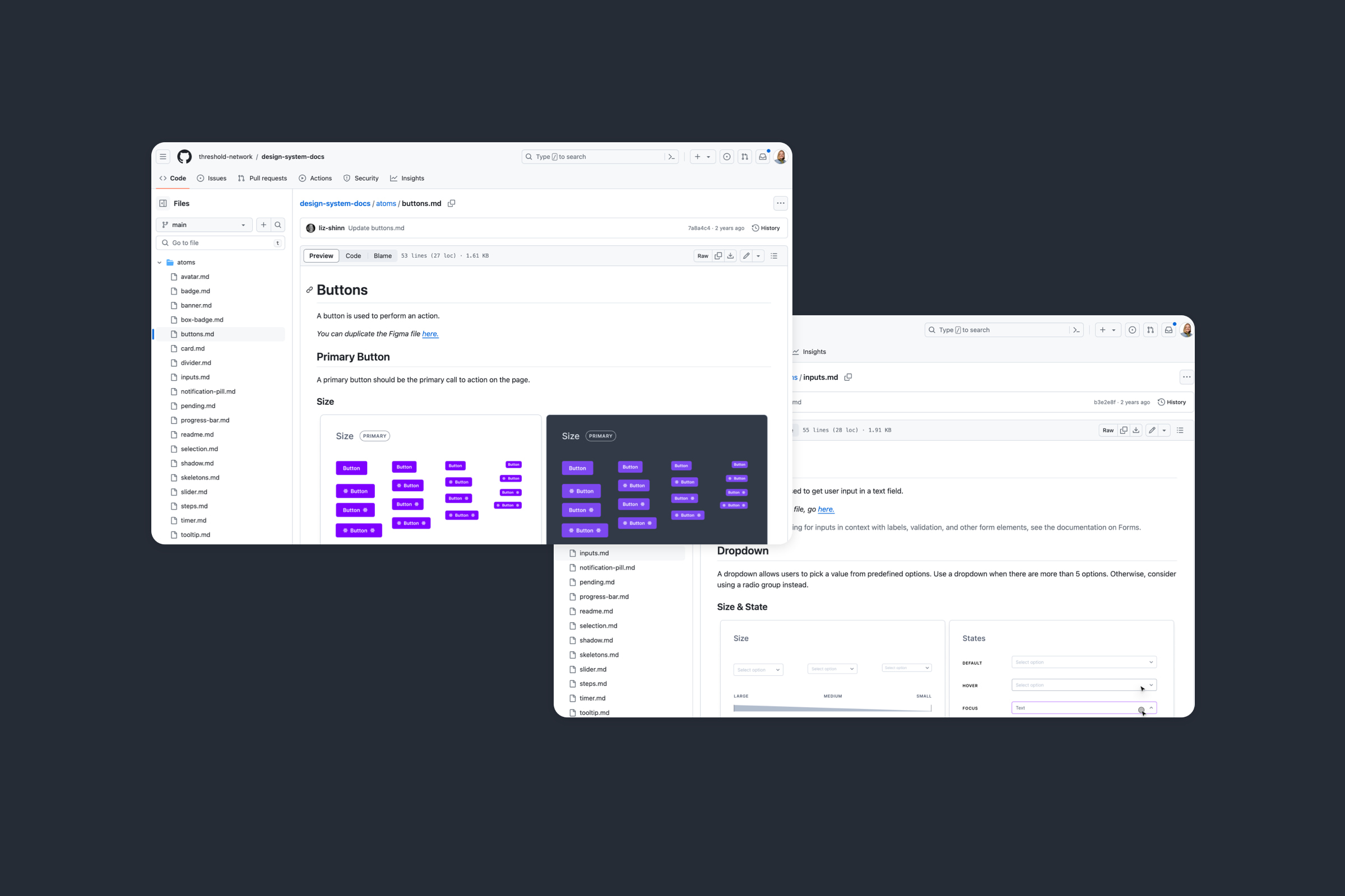
I published Threshold's web3 design documentation and components to GitHub as an open source design system so that other teams could either use it for reference or fork it for use in their own projects.
View Design System